Sunday, October 5, 2014
The Mobile Web should just work for everyone
Update 8/4/2014 - Developers can now preview these updates by joining the Windows Phone Preview for Developers or downloading the Windows Phone 8.1 Update Emulator. Details on platform changes described in this post can be found on MSDN. We have also published updated best practices on updating tailored sites to support standards.
Windows Phone 8.1 Update includes hundreds of Internet Explorer 11 enhancements that greatly increase compatibility with the mobile web.
Based on your feedback, we pursued a web experience for IE users consistent with what is available on iOS and Android devices – even where this meant we would be adding non-standard web platform features. We believe that this is a more pragmatic approach to running today's less-standardised mobile web.
We tested more than 500 of the top mobile web sites and found that the IE11 update improves the experience on more than 40% of them.
For example, if you visit www.twitter.com with IE11, you used to see:
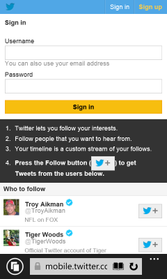
Here is what you see in IE11 with the update, on Firefox OS and on an iPhone:


Similarly, if you visit www.baidu.com with IE11 and Firefox OS, you see:


Here is what you see in IE11 with the update and on an iPhone:


Unlike the mostly standards-based ‘desktop' web, many modern mobile web pages were designed and built for iOS and the iPhone. This results in users of other devices often receiving a degraded experience.
A few weeks ago we talked about our vision and priorities for the web. We believe that "The Web should just work for everyone – users, developers and businesses." We started researching what it would take to make the mobile web "just work" for our customers.
As we investigated the most popular mobile web sites from around the world we started to see common patterns causing problems. Often sites would use poorly written browser detection code that would result in the desktop site experience for Windows Phone users. Desktop web sites tend to be larger and slower to load costing more of a user's data plan. These sites end up with tiny text and you have to spend a lot of time zooming and panning around to read the content. They also expect you to be using a mouse and so menus and forms are hard to work with.
When Windows Phone 8.1 reached RTM, it included the same fast, standards-based, IE11 browser engine that powers the PC version of IE on the desktop. For the last several years we've talked about providing the same mark-up to all browsers using feature detection and graceful degradation. Although we still see broken desktop sites not following this guidance from time to time, the situation has improved on the desktop. We found a much different situation on the mobile web. Many sites use features via a legacy vendor specific prefix without supporting the un-prefixed standard version or only support vendor prefixes for certain devices. Other sites use non-standard proprietary APIs that only work with Safari or Chrome. Of course there were also bugs or missing features in IE that became particularly apparent on mobile sites designed specifically for our competitors' browsers.
We gathered all of this compatibility data and then we began to plan what changes we should make to IE. The remainder of this blog post discusses some of the most important changes and the rationale for why we made them. The issues affecting mobile web sites fall primarily into five main categories:
Faulty browser detection not recognising IE as a mobile browser and giving the desktop experienceUsing only old webkit-prefixed features that have been replaced by standardsUsing proprietary webkit-prefixed features for which there is no standardUsing features that IE does not support with no graceful fall-backRunning into interoperability bugs and implementation differences in IEOne of the most significant issues we saw was related to sites not detecting that IE on Windows Phone is a mobile browser and therefore providing desktop content. This often results in sites displayed with tiny text that you need to zoom in to read and then pan around. It also often means more data is transmitted over the phone's data connection because the content isn't mobile optimised. Images are large and many more ads are downloaded and shown.
There are many different ways that sites try to detect whether to deliver the mobile experience. Here is one such check we found on a real site:
window.mobileCheck = function() {
var check = false;
(function(a){if(/(android|bb\d+|meego).+mobile|avantgo|bada\/|blackberry|blazer|compal|elaine|fennec|hiptop|iemobile|ip(hone|od)|iris|kindle|lge |maemo|midp|mmp|mobile.+firefox|netfront|opera m(ob|in)i|palm( os)?|phone|p(ixi|re)\/|plucker|pocket|psp|series(4|6)0|symbian|treo|up\.(browser|link)|vodafone|wap|windows (ce|phone)|xda|xiino/i.test(a)||/1207|6310|6590|3gso|4thp|50[1-6]i|770s|802s|a wa|abac|ac(er|oo|s\-)|ai(ko|rn)|al(av|ca|co)|amoi|an(ex|ny|yw)|aptu|ar(ch|go)|as(te|us)|attw|au(di|\-m|r |s )|avan|be(ck|ll|nq)|bi(lb|rd)|bl(ac|az)|br(e|v)w|bumb|bw\-(n|u)|c55\/|capi|ccwa|cdm\-|cell|chtm|cldc|cmd\-|co(mp|nd)|craw|da(it|ll|ng)|dbte|dc\-s|devi|dica|dmob|do(c|p)o|ds(12|\-d)|el(49|ai)|em(l2|ul)|er(ic|k0)|esl8|ez([4-7]0|os|wa|ze)|fetc|fly(\-|_)|g1 u|g560|gene|gf\-5|g\-mo|go(\.w|od)|gr(ad|un)|haie|hcit|hd\-(m|p|t)|hei\-|hi(pt|ta)|hp( i|ip)|hs\-c|ht(c(\-| |_|a|g|p|s|t)|tp)|hu(aw|tc)|i\-(20|go|ma)|i230|iac( |\-|\/)|ibro|idea|ig01|ikom|im1k|inno|ipaq|iris|ja(t|v)a|jbro|jemu|jigs|kddi|keji|kgt( |\/)|klon|kpt |kwc\-|kyo(c|k)|le(no|xi)|lg( g|\/(k|l|u)|50|54|\-[a-w])|libw|lynx|m1\-w|m3ga|m50\/|ma(te|ui|xo)|mc(01|21|ca)|m\-cr|me(rc|ri)|mi(o8|oa|ts)|mmef|mo(01|02|bi|de|do|t(\-| |o|v)|zz)|mt(50|p1|v )|mwbp|mywa|n10[0-2]|n20[2-3]|n30(0|2)|n50(0|2|5)|n7(0(0|1)|10)|ne((c|m)\-|on|tf|wf|wg|wt)|nok(6|i)|nzph|o2im|op(ti|wv)|oran|owg1|p800|pan(a|d|t)|pdxg|pg(13|\-([1-8]|c))|phil|pire|pl(ay|uc)|pn\-2|po(ck|rt|se)|prox|psio|pt\-g|qa\-a|qc(07|12|21|32|60|\-[2-7]|i\-)|qtek|r380|r600|raks|rim9|ro(ve|zo)|s55\/|sa(ge|ma|mm|ms|ny|va)|sc(01|h\-|oo|p\-)|sdk\/|se(c(\-|0|1)|47|mc|nd|ri)|sgh\-|shar|sie(\-|m)|sk\-0|sl(45|id)|sm(al|ar|b3|it|t5)|so(ft|ny)|sp(01|h\-|v\-|v )|sy(01|mb)|t2(18|50)|t6(00|10|18)|ta(gt|lk)|tcl\-|tdg\-|tel(i|m)|tim\-|t\-mo|to(pl|sh)|ts(70|m\-|m3|m5)|tx\-9|up(\.b|g1|si)|utst|v400|v750|veri|vi(rg|te)|vk(40|5[0-3]|\-v)|vm40|voda|vulc|vx(52|53|60|61|70|80|81|83|85|98)|w3c(\-| )|webc|whit|wi(g |nc|nw)|wmlb|wonu|x700|yas\-|your|zeto|zte\-/i.test(a.substr(0,4)))check = true})(navigator.userAgent||navigator.vendor||window.opera);
return check;
}
We updated the User Agent string in IE on Windows Phone to increase the number of sites that would correctly deliver the best mobile content. This continues an unfortunate pattern that all browsers have had to deal with and most web developers have run into. For example, there is an interesting discussion from as early as 2006 in a WebKit bug entitled "Safari lies. Reports itself as Mozilla, Gecko and KHTML too." When we shipped IE11 on the desktop, we added the token "like Gecko" to the string because it significantly improved compatibility with desktop sites. Chrome and Opera claim to be like Gecko and Safari in order to be compatible with web content.
If you visit www.hawaiianairlines.com with IE11 and Firefox OS, you see the desktop experience:

Here is what you see in IE11 with the update and on an iPhone:


If you visit www.nytimes.com with IE11 and Firefox OS, you also see the desktop experience:


Here is what you see in IE11 with the update and on an iPhone:


In general, our advice is to develop a responsive site that can adapt to the capabilities of different devices. If you choose to build a mobile-specific experience then we recommend looking for the sub-string "mobile" in the user agent string to determine when to deliver mobile optimised content:
function isMobile() {
return navigator.userAgent.toLowerCase().indexOf("mobile")>=0;
}
After changing the user agent string so that IE receives the same content as other phone browsers we could begin to analyse issues that were breaking mobile experiences. The first important problem we identified was that many mobile sites only send webkit-prefixed content for CSS gradients, flexbox, transitions, and animations. These are features that IE11's web standards-based engine already supports for sites with cross-browser mark-up. As Mozilla found, WebKitCSSMatrix is commonly used on mobile devices. IE supports MSCSSMatrix. Many sites also use window.orientation instead of the emerging standard screen.orientation. The second problem we found here is that sites also often use old syntax in their code. For example, using the old gradient syntax instead of the updated standards based approach.
In Windows Phone 8.1 Update, we added a mapping of popular webkit-prefixed APIs to the standards based support already part of IE11. This means that sites that only send WebKit code are translated into standards based code as the page loads. We are not planning to support all webkit-prefixed APIs. We have added mappings for the ones that are so prevalent in mobile sites that the web won't work without them.
If you visit www.macys.com with IE11, you see:

Here you can see the gradients drawn correctly in IE11 with the update and on an iPhone:


If you visit www.answers.com with IE11, you see:

Here you can see the site drawn correctly in IE11 with the update and on an iPhone:


We found a small number of non-standard features popularised by Apple on the iPhone in widespread use. These features are not currently on a standards track but browsers that don't support them can't provide a good experience for top sites on the mobile web. One example is -webkit-appearance, which allows a page to modify the styling of an element to match native applications. As Mozilla points out, "not only is it non-standard, but its behavior changes from one browser to another." Unfortunately, without some level of support for these non-standard proprietary features, web sites are more difficult to use.
There are several standards-based features that IE11 didn't support that are used infrequently on desktop sites, but are in common use in the mobile web. Once we made IE11 receive more mobile content we determined that we would need to add these features. For example, window.locationbar is defined in HTML5 but rarely used on desktop sites. We prioritised implementing several new features based on the mobile sites they enabled.
One of the larger API-related issues affecting compatibility with mobile sites is support for touch. In IE10, we shipped support for Pointer Events, which is now a Candidate Recommendation at W3C, and we updated the implementation in IE11 to incorporate changes in the spec. Using Pointer Events provides many performance and functional advantages to sites that wish to use either mouse, touch, pen or other pointer inputs and we continue to recommend this as the best API for sites that work for users across all of their devices.
On the mobile web, most sites have been coded to use the older Touch Events model and users expect those sites to just work. In the IE11 update, we added support for touch events so that these sites would work correctly. Our research has shown that on the desktop web, enabling touch events on a device that also supports a mouse (like Windows tablets and 2 in 1 devices) causes more problems—for example, we found that mouse and trackpad support is broken on about 10% of top sites when Touch Events are enabled. Many sites don't expect to be able to receive touch events and mouse events and only support one or the other. We have joined other browser vendors in the W3C Touch Events Community Group to work through these issues for the web at large. We have published further details about pointer and touch events in this post.
As we continued to investigate the mark-up in sites that were not working correctly in Internet Explorer, we found some peculiar interoperability issues. For example,
Finally, we also identified several bugs in the Trident engine that particularly impacted top mobile sites and we included fixes for these issues in this update. For example, we fixed some navigation issues with location.hash and some CSS layout problems that were affecting popular mobile sites.
Many of the changes we've made are specifically targeted at consuming legacy or vendor prefixed content published on these sites. It is not our goal to support all the -webkit- vendor prefixed APIs. While we will continue our outreach efforts to encourage these sites to adopt standards-based mark-up, the support we've added is necessary today for the mobile web to just work. You can help here too if you see sites using non-standard code: we are collaborating with Mozilla at webcompat.com to record broken sites. These sites often cause issues across multiple browsers including Firefox and IE and it is easy for you to report problematic sites.
If you are a web developer, run your site through the scanner tool on http://modern.ie. This tool will identify common coding problems including issues with vendor prefixes and help you fix your code.
When taken all together, the changes we have made to IE in Windows Phone 8.1 Update dramatically improve compatibility with the most popular mobile web sites. The update is rolling out to those of you already on the Windows Phone 8.1 Preview for Developers and will roll out to consumers with devices running Windows Phone 8.1 in the coming months. We have also published a comprehensive list of all the changes in the IE Developer Guide on MSDN.
If you have questions, you can connect with us on Twitter @IEDevChat. The next #AskIE tweet chat is today (July 31) from 10AM-Noon PDT. Make sure you include #AskIE in your questions.
Adrian Bateman
Program Manager, Internet Explorer
Frank Olivier
Program Manager, Internet Explorer
No comments: